
So I decided to go with dark colors but I would like to fix the F on fierce and make it more visible. I also would like to change the story title into a brighter color like teal. I choose teal because my image will have a woman in teal Nike pants. The color coordination will be strong.
I plan to have my magazine cover page done by Sunday and begin with my table of contents.

This is a pallet of the different shades, I was thinking of going with the top center color. It is the brightest teal and it will stand out. I think colors are beyond important when creating your cover page because you need to use images and colors that will grab peoples attention quickly.
As a magazine reader I think there are two ways to go with your magazine. I either like to see a nice color coordination with a color pop or a simplistic page with not tooo many colors but not too bland.
 This magazine has nice color schemes because it is all bland but the different designs in colors on her make the magazine appealing. Although I think the masthead should be a different color because it is slightly hard to read but other than that it is beyond appealing.
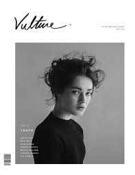 This magazine has more of a simplistic look. It is not too bland, it is classy and eye catching. I think it reaches who it is trying to reach.
No comments:
Post a Comment